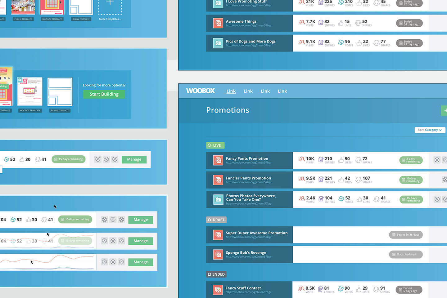
Marketing App UI/UX
Woobox is a platform used by millions to build and manage marketing campaigns. The Campaign Creation process is the series of steps and associated UI elements through which users select a campaign type, configure key settings, and modify aesthetics. This process is the core of the Woobox service as all users must go through it prior to launching their own campaign.

Due to resource limitations the design of the creation process and dashboard hadn’t received as much attention as its importance warranted. However Woobox wanted to change this. Their research unearthed several key issues, among them trial user drop off, that they wanted to remedy.
In collaboration with the Woobox team, I sought to address these issues through an iterative process of analysis and design. The goal of this process was to generate a series of solutions that would improve the Campaign Creation process and the dashboard. Aesthetics were not a key consideration in this engagement, but instead the user experience: user flow, layout, interactions.